I've always been a very visual person. As a young child, I had an interesting ability to be able to subconsciously scan the landscape and immediately pick out things that were out of place. On my way to work or otherwise driving around town, my eyes are scanning the passenger's, rear-view and driver's side mirrors every few seconds looking for things that make driving around Los Angeles perilous.
When it comes to complex problems related to security, or even just things that may present obstacles to those in the software development world, I continue to like visual approaches to their solutions. In Perl, Data::Dumper and I are real close. In Java, Ruby other languages, sometimes I take the gross but sometimes workable solution of putting debug print statements everywhere in my code and then prepare for the textual onslaught. All to often, however, there is simply too much output for the human mind to make sense of in a reasonable amount of time and that is where graphical representations of the problem are very helpful.
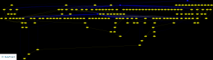
A month or so back here at Rapid7, we were working on verifying the accuracy of our vulnerability checks for Microsoft Windows. In some cases, the verification was straight forward. In the majority of them, however, it was a complex game of tracing supersedence, version and architecture dependencies and other things that make this effort not for the feint of heart. For many Microsoft security bulletins, if you were to trace the supersedence tree, you'll find that it spans ten or more bulletins scattered over many years. As a small and somewhat recent example, consider MS10-002. If you trace this back, you'll see that this supersedes MS09-072, which supersedes MS09-054, which supersedes MS09-034, which supersedes MS09-019 and so on, all the way back at least to MS05-052. Not too surprising, given that these are all cumulative updates for Internet Explorer and IE's rap sheet is quite colorful.
If you are able to obtain this supersedence information, a graphical representation is simply a handful of lines of code in your programming language of choice combined with Graphviz away. The result isn't pretty, however, thanks to the principle of Garbage in, Garbage Out (GIGO), and there were many debates about how to make this prettier. Even once you make it "pretty", you still have the problem of usability -- the resulting image was an 8M, 12849x10076 pixel monster that kills most browsers and exceeds the file upload size of this blog many times over. As a result, I've had to trim it to only include hotfixes from 2008-2010, but the idea is still there:
Other techniques we have used (or considered using) to identify problems and understand relationships between Microsoft Security Bulletins include:
- After a host was audited, "light up" Microsoft Bulletin nodes in red when a host was identified as vulnerable. When it wasn't vulnerable to a particular vulnerability, do nothing. To ease visual QA, you simply need to identify any red nodes whose parents were not also red.
- Looking for long chains of supersedence. This either indicates cumulative bulletins similar to the IE example given earlier, or a particularly problematic area of Microsoft's codebase.
- Programmatically flagging problematic vulnerabilities by analyzing the supersedence relationships, overlaying the vulnerability results for a given node on top of them, and finding any "holes"
- Including service packs in the supersedence graph, looking for offshoots rooted at service packs that are particularly dense.
tl;dr? Visualization is your friend.
