
While analyzing data, it’s important to use a variety of calculations to ensure you get the best insights. Today, we’re excited to announce the availability of our two newest LEQL functions: percentile() and median.
percentile() allows you to calculate the number below which a given percentage of your log entries fall. To use a real world example, what was the longest response time for 95% of my application’s users? Similarly, median (or the 50th Percentile) gives you the middle number in a set of values.
These calculations exclude “spikes” or “outliers” that could otherwise affect your statistics. For example, a few particularly long response times could skew the average calculation. Conversely, an average figure might be skewed by a minority of your data.
Just like other LEQL functions, percentile() and median can be used with groups of data (for example, groupBy(hostname), to see performance grouped by different servers), or over a time range – and of course, by using our recently introduced timeslice() keyword, you can specify how granular the time range should be.
How do I use it?
If you are using the LEQL Querybuilder in advanced mode, you can calculate a percentile value like this, where the number in brackets is the percentile you want to return, and key is the name part of the Key Value Pair that you are querying. You can specify up to 3 decimal points:
calculate(percentile(99.99:key))
To calculate the median, it’s the same as using max, min, average and count unique:
calculate(median:keyname)
If you prefer using the Querybuilder in simple mode, you will see that we have included 95th, 99th Percentile and Median in the dropdown list of calculate functions. You will need to switch to advanced mode if you want so specify a custom percentile value.
You can enter up to 3 decimal points in advanced mode. The results are interpolated, so smaller data sets can be calculated.
Let’s see it in action
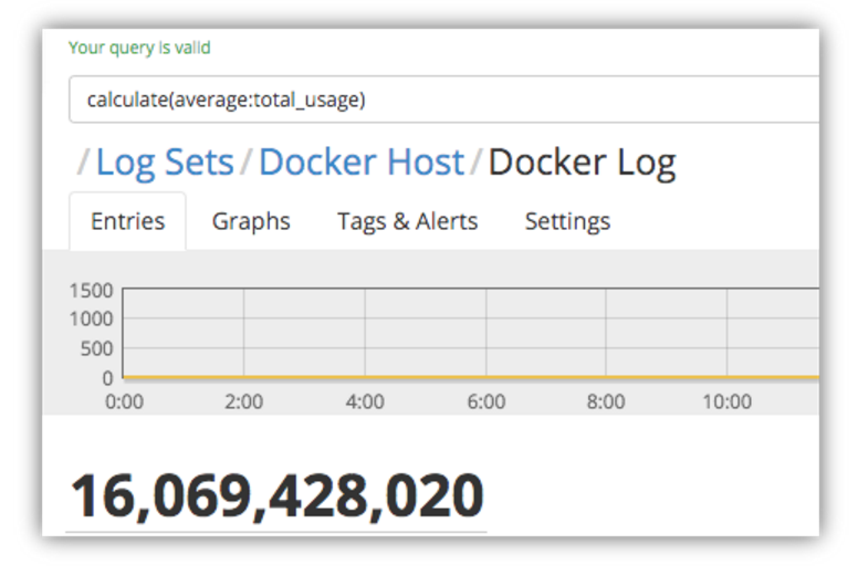
These are actual memory usage statistics that were collected from Docker containers running on a host machine. Let’s have a look at the average memory usage across the containers:
And now the max memory usage:
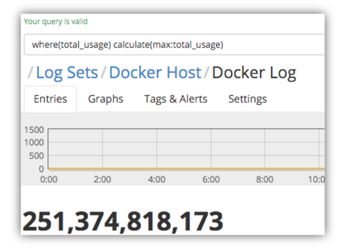
As you can see, there’s a huge difference in the two values – but just one spike in a given time period could cause this, so it’s not easy to tell how frequent this high usage was without running the query over a very granular timeframe, so we need to do a bit more digging around.
First, let’s see what the highest memory usage is 95% of the time, so we can get a picture of the majority of our entries by excluding spikes and outliers that might otherwise skew the calculations.
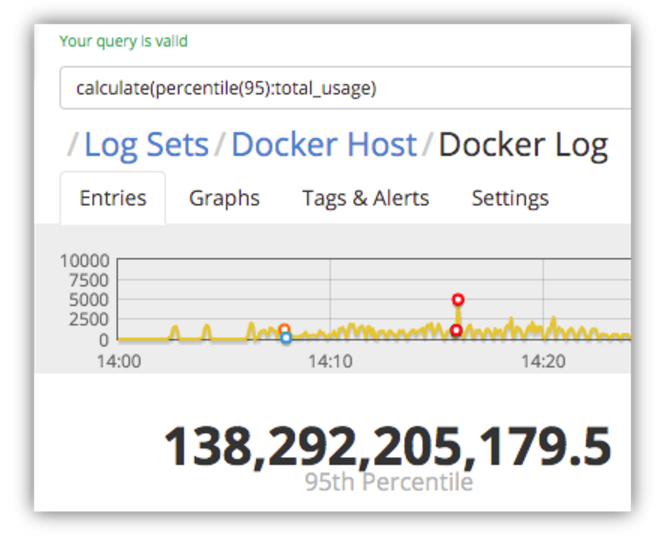
So, for 95% of the memory usage stats that were logged, the memory usage was at least half of what the maximum usage.
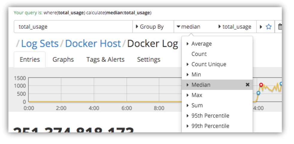
Next let’s have a look at the median value – i.e. the middle value in the set of log entries that we’re analyzing.
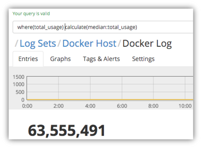
We can see that 50% of the log entries reported memory usage that is far lower than the average usage that we calculated earlier.
Now, using different percentile values, you can work out what sort of distribution of entries are affecting the overall average statistics.
Let’s see where 85% of the memory usage stats fall in the data set:
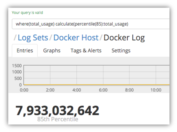
This is still under half of the average memory usage, telling us that there is a significant minority (15%) of log entries that are reporting high enough usage figures to skew the average figures upwards considerably.
What Have We Learned?
We can quickly see that the average figure is, in fact, significantly higher than most of the usage statistics that were reported. We can see that the vast majority (95%) of the statistics are reporting memory usage that is half the maximum usage, but there is a significant minority (15%) of log entries that are skewing the average for everyone, which in turn indicates that the maximum usage figure returned is not due to infrequent spikes.
Using these calculations together provides a much richer insight into your log data for root cause analysis, but also helps you calculate valuable summary information.
In Summary
Using these two new LEQL functions – percentile() & median– in conjunction with max, average, timeslice() and groupby(), you can identify the distribution of a set of data so you can quickly and easily answer questions such as whether the maximum values are aberrations or actually indicative of a trend, and how representative an average value really is. Try adding these queries to a dashboard to get this instant insight into your log data.